Fullscreen Clock Readability Across the Room
A room clock is not read the same way as a browser tab. It has to work from a distance, in changing light, and often while people are doing something else. That changes what good looks like.
A useful fullscreen clock is usually obvious before it feels stylish. People should be able to glance up, understand the time, and move on. If they need a second look, the screen may be doing too much.
That is why a fullscreen online clock view works best when users treat readability as the first setting decision. This article explains what makes a room clock easier to read, how room type changes the setup, and how to test the display in a real space.
Disclaimer: The information and assessments provided are for educational purposes only and should not replace professional medical advice, diagnosis, or treatment.
Why a room clock has different readability needs
A small desk tool can rely on close viewing. A room clock cannot. It has to compete with distance, glare, wall color, screen brightness, and the simple fact that most people are not staring directly at it all day.
That is why layout matters more than people expect. A clock that looks fine on a laptop at arm's length can feel weak once the same screen is moved to a shelf, wall, or classroom corner. The farther away the viewer is, the more every extra detail has to justify itself.
The site's always-on clock page is most useful when people test it where it will actually live. A clock that reads well at the desk but not from the doorway is not really set up yet.
What makes a fullscreen clock easier to read
Size, contrast, and uncluttered layout
The first question is simple: can the main time be recognized immediately? Large numbers, strong contrast, and a clean layout usually matter more than extra information.
The [U.S. Web Design System typography guidance] says body text should be at least 16px on desktop and 15px on mobile for readability. A room clock is often much larger than body text, but the same lesson still applies. Small, delicate elements become harder to read as viewing distance grows.
Contrast matters just as much. A bright display on a dark background can feel crisp across a room. A low-contrast theme may look modern up close, then disappear in ordinary light. The best room clocks favor obvious time over subtle styling.
Why fewer on-screen elements often help
More information does not always create a better screen. It often creates a busier one. A clock that shows time, seconds, date, weekday, and extra labels can become harder to scan from far away.
USWDS notes that long chunks of italic or uppercase text are more difficult to read. While a digital clock is not a paragraph, the same principle applies to dense screens: when too many visual signals compete, the main message becomes slower to catch.
That is why many strong room clocks start with time only. Then users add one more element, such as date, only if it improves the space instead of crowding it.
How room type changes the best setup
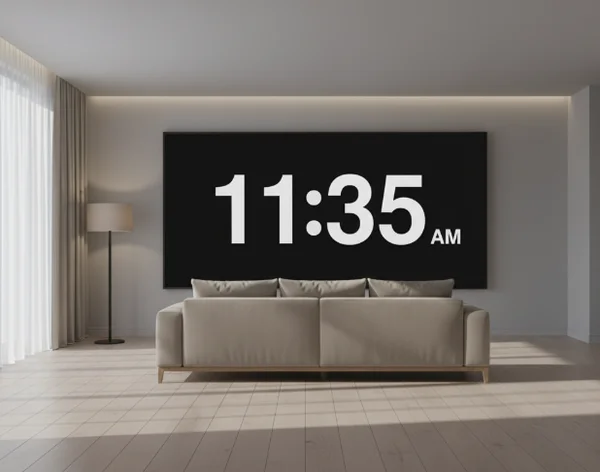
Desks and focus spaces
A desk clock can be a little richer because the viewer is closer. That makes it a good place to decide whether extra context actually helps. Some people like seconds because they sharpen time awareness. Others prefer a calmer display with just hours and minutes.
This is also where theme choice becomes personal. A dark background may feel quieter during focused work, while a brighter screen may stand out better in daylight. The better option is the one that stays readable during the real task, not the one that only looks good for a moment.
For many desks, a live room-clock test works better than theory. Try one simple version first. Then add or remove elements based on how often the eyes have to re-read the screen.
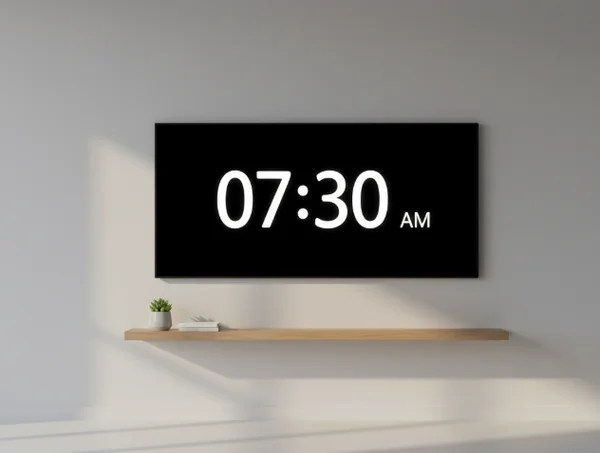
Kitchens, classrooms, and shared rooms
Shared rooms usually need more clarity and less personality. More people are reading the screen, and they may be seeing it from very different angles. That makes simplicity more valuable.
In these spaces, date or weekday information can help if the screen stays visible all day. It gives the room a little more context without forcing anyone to check another device. But the main time still has to dominate the layout.
A kitchen clock may need quick readability in changing light. A classroom clock may need obvious time from the back of the room. A shared office clock may need to stay visible without becoming visually noisy. These are different rooms, but the same rule applies: let the main time do most of the work.
A simple workflow for testing your clock view
Start with time only, then add context
The safest setup process is to begin with the simplest screen possible. Show the time first. Then ask whether the room truly benefits from one more layer such as seconds, date, or weekday.
The U.S. Web Design System says readable line lengths usually fall between 45 and 90 characters, with an ideal average around 66. A room clock is not body copy, but the principle still helps. A screen becomes harder to scan when too many elements stretch attention across more space than needed.
Starting simple also makes the value of each extra element easier to judge. If the date helps, keep it. If seconds only create motion, remove them.
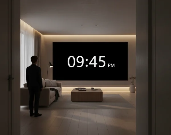
Recheck the display from real viewing distance
Testing from the chair is not enough. Walk back. Stand in the doorway. Look from the far corner. A room clock should still work where it will actually be seen.
The [U.S. Web Design System accessibility tests page] says body text needs a 4.5:1 contrast ratio, while large text can use 3:1. That is a practical reminder to test the screen against real brightness and background conditions, not just a perfect viewing angle.
A good final check is fast. Look once. If the time lands immediately, the setup is probably working. If the eyes have to search, simplify again.
Next steps for a cleaner room clock
A good room clock is large enough to read, clear enough to trust, and simple enough to scan in one glance. That usually means strong contrast, obvious numbers, and fewer extra elements than people first expect.
That is why the fullscreen clock homepage works best as a live testing tool. Open it where the screen will stay. Start with the cleanest version, then add only the context that genuinely helps the room.
If visual strain, time-related stress, or sleep disruption becomes severe or persistent, seek professional help from a qualified healthcare provider instead of relying on online information alone.